Preferences
Privacy is important to us, so you have the option of disabling certain types of storage that may not be necessary for the basic functioning of the website. Blocking categories may impact your experience on the website. More information
Privacy is important to us, so you have the option of disabling certain types of storage that may not be necessary for the basic functioning of the website. Blocking categories may impact your experience on the website. More information

SEO accessibility explained: the headings, alt text, links and tests that make pages readable for screen readers, Google and AI, with an audit plan.

In short
SEO accessibility means building pages that keyboards, screen readers, search crawlers and AI systems can all read without guessing. In practice that means one clear h1, a logical heading order, a title that names the page, alt text that describes each meaningful image, and link text that tells the reader where the link goes. These fixes are not a switch that lifts you up the rankings on their own, but they remove the problems that stop a page from being understood, indexed and cited.
Want to go further? Ask
Quick quiz
Is SEO right for you, and how should you start?
Sorank matches your answers


Test it for 3 days on your own site and see where you stand on Google, ChatGPT and the other AIs.
Start 3-day free trial3 days free, then stop whenever you want. 90-day results guarantee, conditions apply.
Web accessibility means a site works for people who browse without a mouse, who use a screen reader, who rely on voice control, or who need larger text and high contrast. Most of the rules come from the Web Content Accessibility Guidelines (WCAG), published by the W3C. SEO accessibility is the overlap: the part of those rules that also changes how search engines read your pages.
A screen reader reads your page in order, announces the headings and reads image descriptions aloud. A search crawler works from the same HTML. It follows links, reads titles and works out what each image is about. When a page is clear to one of them, it is usually clear to the other.
Most accessibility fixes are not design work. They are choices about markup. Is that heading a real heading or a bold paragraph? Is that clickable box a link, or a div with a click handler? Does that image have a text alternative? A page can look identical on screen while its code is either readable or a mess. That is why one fix can help a blind visitor, a crawler and a language model at the same time.
It does not replace keyword research, a sound content plan or link building. Keyword targeting and link acquisition are not WCAG issues at all. An accessible page about the wrong topic still ranks poorly. Treat accessibility as the layer that makes good content easy to find and easy to read, not as the content itself.
Visual polish only vs markup that works for everyone
Google's documentation on images and links gives concrete rules. Use descriptive alt text. Use a real link element with an href. Write anchor text that is "descriptive, reasonably concise, and relevant to the page that it's on." None of the Google pages we read presents accessibility as a ranking factor, so do not sell it as a guaranteed ranking boost.
Accessible markup changes three things you can measure. A clear structure is easier for a crawler to parse, so it has less guessing to do. A reader who can move around the page without friction has more reasons to stay and finish. And the text a screen reader announces is usually the same text an AI system reads when it summarizes your page. None of these is guaranteed. Together, they make the same content work harder.
The standard behind the advice
Source: W3C Web Accessibility Initiative, What's New in WCAG 2.2

The title is the first thing a screen reader announces when a page loads, and it is the main line of a search result. Write it so it works in both places. Put the topic first, add the brand only if it helps, and keep the title short enough to show in full in results. "Products" tells nobody anything. "Blue Running Shoes: Size Guide and Returns" tells a visitor and a crawler what the page is for.
Every page needs its own title. Duplicate titles across a template are common, and they make it hard for a crawler and a screen reader user to tell pages apart.
Headings are the navigation of a page for a screen reader user. The user can jump from heading to heading and skip everything else. The W3C Web Accessibility Initiative headings tutorial asks you to nest headings by rank and to avoid skipping ranks where you can. Skipping is fine when you close a subsection, for example when you return from a run of h3 items to the next h2. Your outline should read like a table of contents:
Our guide to formatting a blog post applies the same rules to a full article, section by section.
Headings are one part of semantic HTML. A list should be a list element, navigation belongs in a nav element, the central content should be marked as main, and an action should be a button. Each element tells assistive technology and crawlers what a block is. For the full tag list and the trade-offs, read our guide to semantic HTML. The table below shows what each element gives a screen reader user and a crawler, and where it is most often misused.
| Element | What a screen reader user gets | What crawlers and AI get | Common misuse |
|---|---|---|---|
| title | The page name when the tab opens | The main label in search results | The same title on every page |
| h1 to h6 | The page outline and jump points | Section topics and their hierarchy | Heading levels picked for font size |
| nav | A named navigation landmark | The site structure in the menu | Menus built from plain divs |
| main | A direct jump to the central content | Content separated from repeated boilerplate | No main element, or several on one page |
| ul and ol | Items announced with their count | Items grouped as belonging together | Lines separated by line breaks |
| button | An action announced as a button | No URL to follow, so no link equity passed | Clickable divs with no keyboard support |
Tip
Paste any URL into our free Heading Structure Analyzer to see the h1 to h6 outline of a page in seconds, then compare it with the list above.
The alt attribute is the text an image falls back to. Screen readers read it aloud, and browsers show it when an image cannot load. Google's image guidance says it extracts an image's subject from the content around it, including captions and image titles. It asks for useful alt text that uses keywords appropriately, and it warns against filling alt attributes with keywords. For the basics, see our alt text guide.
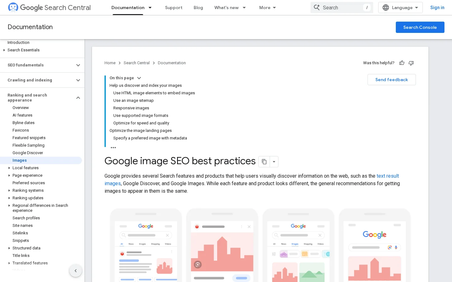
Google also recommends short, descriptive file names. A file called black-kitten-on-sofa.jpg says more than IMG_0023.JPG, and renaming costs nothing before upload. Place each image next to text on the same subject. A caption under the image is read by people, and it gives search engines another description, so write it as a real sentence. For file size, dimensions and image sitemaps, read our image SEO guide.
<!-- Meaningful chart: describe what it shows -->
<img src="/images/ctr-by-position.png" alt="Bar chart of click-through rate by search position, highest at position 1" width="1200" height="675">

<!-- Decorative divider: empty alt, so screen readers skip it -->
<img src="/images/divider.svg" alt="">
Tip
Run your pages through our free Alt Text Checker to find images with no proper alt attribute. Fix the meaningful ones first, then set the decorative ones to an empty alt.
Screen reader users can pull up the full list of links on a page and read it out of context. A list of "click here" and "read more" tells them nothing. Google's link guidance says the same: good anchor text is descriptive, reasonably concise and relevant to the page it sits on. Test your own pages this way: copy the link texts into a list and read it from top to bottom. Each entry should make sense on its own.
Internal links follow the same rule. Name the target by its topic, not by its URL and not by a generic phrase. Vary the wording so it reads naturally, but do not repeat the exact keyword on every link. For the balance question, see our guide to anchor text optimization.
Mark repeated navigation with a nav element, and give it a name when a page has more than one. Put a skip link first on the page, so a keyboard user can jump past the menu to the main content. Breadcrumbs help both groups: they show the path in a fixed order and add internal links with clear text. Keep menus focused on the pages that matter. A menu with forty entries is hard for everyone to scan.
| Link text | Verdict | Better version |
|---|---|---|
| "Click here" | Says nothing about the target | "Download the alt text checklist" |
| "Read more" on every card | Identical links, no way to tell them apart | "Read more about heading structure" |
| A raw URL such as example.com/page-12 | Hard to scan and awkward to read aloud | The name of the target page |
| "Learn more" under a product | Generic and repeated | "Learn more about the return policy" |
Google can only crawl a link when it is a link element with an href attribute. A click handler on a div, or a link that only works through JavaScript, may never reach the crawler. Google also advises against JavaScript URLs in href attributes, because the crawler may not resolve them reliably. Use a real address in href, then let JavaScript add behavior on top of it.
Anything that does something must be reachable with the Tab key and triggered with Enter or Space. A button does this by default. A div with a click listener does not, so a keyboard user cannot reach it and a screen reader does not know it exists. If you build an interactive element yourself, it needs three things: focus, keyboard handling and a visible focus style. Missing any one of them traps or hides the control.
Link or button: what crawlers and keyboards can use
<!-- Weak: no href, no keyboard focus, no link for crawlers -->
<div class="card" onclick="location.href='/glossary-geo-seo/alt-text'">Alt text</div>

<!-- Better: a real link, the whole card stays clickable -->
<a class="card" href="/glossary-geo-seo/alt-text">Alt text: write descriptions that help</a>Most interface problems come from one of three choices. You use native HTML, you add ARIA to something that has no meaning, or you build a custom widget from scratch. Each has its place, and each has a typical way to fail.
Principle: use the element the browser already knows. Buttons, select menus, details elements and dialogs come with roles and keyboard handling. Use it when the element matches the behavior you need. Advantages: keyboard and screen reader support for free, less code to maintain, and clean markup for crawlers. Limits: native elements do not cover every design, and some looks are harder to reach. Example: a details element for a FAQ, instead of a div that toggles a class.
<!-- Native: no ARIA needed, keyboard and screen readers work -->
<details>
  <summary>What is alt text?</summary>
  <p>The text an image falls back to.</p>
</details>Principle: ARIA adds roles, states and labels to elements that have no native meaning. Use it when you cannot use native HTML, for example a switch built on a div. Advantages: it fills real gaps in the platform. Limits: ARIA changes only what assistive technology announces. It adds no keyboard behavior and does not change what a crawler sees. Wrong ARIA is worse than none, because it tells a screen reader something false.
<!-- Custom switch on a div: ARIA gives the state, your JavaScript must handle Space, Enter and the state updates -->
<div role="switch" aria-checked="false" tabindex="0">Show prices</div>
Warning
An ARIA role gives an element no keyboard behavior. The switch above still needs JavaScript for Space and Enter, and it must update aria-checked every time the state changes. If you cannot maintain that, use a real checkbox with a visible label instead.
Principle: build the whole component yourself: roles, states, focus management and the keyboard model. Use it when the interface is complex and no native element fits, such as a date picker or a drag-and-drop editor. Advantages: full control of look and behavior. Limits: the highest cost. Every widget needs keyboard and screen reader tests. Start from a proven pattern in the W3C ARIA Authoring Practices Guide, and test the result yourself, because libraries break too.
| Method | Use when | Advantages | Limits | Example |
|---|---|---|---|---|
| Native HTML | The element matches the behavior | Keyboard and roles built in, cheapest to maintain | Less freedom for unusual designs | A details element for a FAQ |
| ARIA on custom markup | No native element exists | Adds roles, states and labels | No keyboard behavior, wrong use misleads | A switch with role and aria-checked |
| Custom widget | Complex interactions with no native fit | Full control of look and behavior | Highest cost, needs manual testing | A date picker built to ARIA patterns |
Each testing method finds a different class of problem. Use all four on your main templates, not just one.
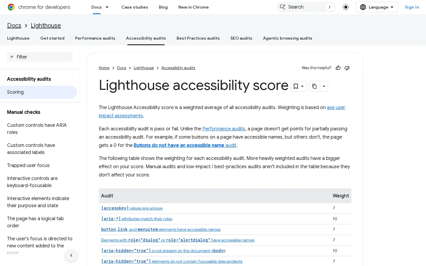
Automated checkers are the fastest start. Lighthouse runs inside Chrome DevTools, and WAVE checks a live URL in your browser. Lighthouse's accessibility score is a weighted average of rule-based audits drawn from axe. An audit gets no partial credit: if only some buttons have accessible names, that audit scores zero. Manual checks are listed separately and do not affect the score. Automated tools find missing alt attributes, empty links and low contrast. They cannot tell whether an alt text is accurate or whether a heading makes sense.
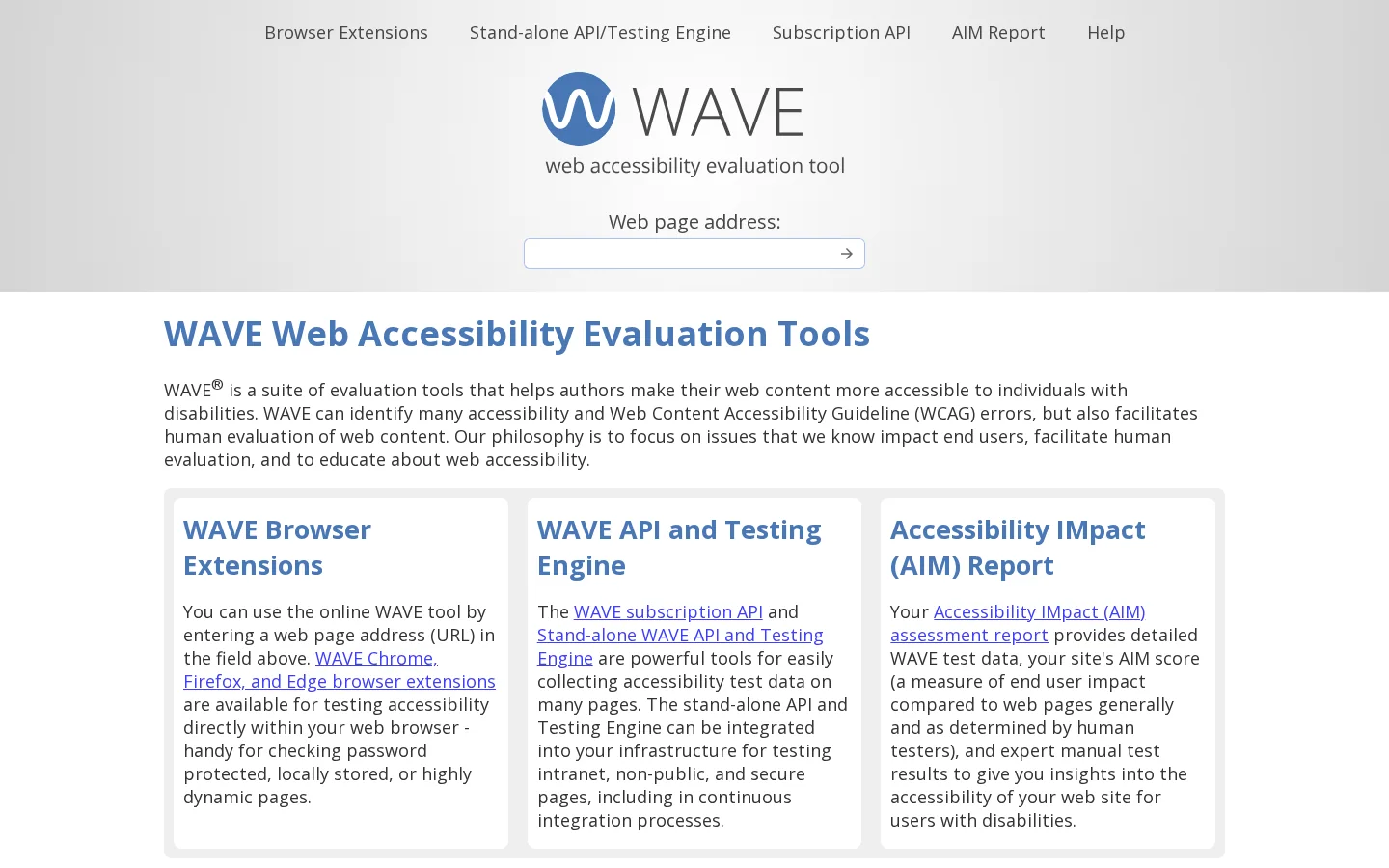
For how Lighthouse builds its score, the Chrome for Developers scoring documentation is the reference.
Leave the mouse alone and press Tab from the top of the page. Can you see where the focus is at every step? Can you reach every link, button and form field? Does anything trap the focus? Do menus open with Enter and close with Escape? This test takes minutes per template, and it finds the problems that automated checkers cannot see.
Use a screen reader on the main templates. NVDA on Windows and VoiceOver on macOS and iOS are the usual choices, and VoiceOver ships with Apple devices. Open the headings list and check that it matches the page outline. Open the links list and read it. Listen to a form and check that each field announces its label. The first sessions are slow, and that is normal, because each run teaches you what the announcements sound like.
Ask people who use assistive technology to complete one task: find a price, read an article, submit a form. Watch where they stop. Tools can tell you that a rule failed, but only a real session shows which failures block a task. Run a few sessions before a large redesign. This costs time or money, so plan it as a project, not an afternoon.
| Method | Time | Catches | Misses | Cost |
|---|---|---|---|---|
| Automated checker | Minutes per page | Missing alt attributes, empty links, low contrast | Whether an alt text is accurate | Free |
| Keyboard test | Minutes per template | Unreachable controls, focus traps, hidden focus | What a screen reader announces | Free |
| Screen reader test | Slow at first, faster later | Wrong or missing announcements | Whether the visual layout makes sense | Free, with a learning curve |
| Real users | Days to organize | The failures that block a real task | Scale and statistics | Paid or time-consuming |
For the wider tool list, see our guide to the best technical SEO tools.
Five steps from export to retest
Crawl the site and export the URL, the title, the h1 and the status code of each page. Sort by title to find duplicates, and filter for pages with no h1. Pages with a 4xx or 5xx status come first, because a broken page cannot be read by anyone.
For each main template, open one page and check its outline with the heading analyzer. Look for three problems: two h1s or none, a skipped level that is not a closed subsection, and headings used only for their size. Fix the template rather than each page, so every page that uses it benefits.
Export the images with their alt text, then sort them into three groups. Meaningful images need a description. Decorative images need alt="". Images with alt text that is wrong, empty or stuffed with keywords need a rewrite. Start with the meaningful images on your highest-traffic pages.
Tab through the home page, one article, one product or service page and any form. Note every control you cannot reach, every focus outline that disappears, and every menu that ignores the keyboard. These usually come from the same component, so one fix often clears several pages.
Fix the templates first, then the pages. Retest with the same tools and compare the results with your export. An audit becomes a process only when each run is measured against the last one, so keep the export from step 1.
What it is: alt text that lists keywords instead of describing the image, for example "seo tools best seo tool seo software". Google warns against filling alt attributes with keywords, and a screen reader user hears every word of it.
How to spot it: read the alt values in your export. Any alt that runs longer than a sentence, repeats a phrase, or describes nothing visible in the image is a suspect. Identical alt text across many different images is a strong signal.
How to fix it: rewrite each one as a description of what the image shows, in the paragraph where it sits. If the image carries no information, set alt="" and move on.
What it is: an h4 chosen because it looks right, or a heading added to a line that is really a label. The outline then misstates the structure of the page.
How to spot it: read the heading outline. A page that jumps from h1 to h4, or that holds a dozen headings of the same level with no sections between them, has this problem.
How to fix it: set the heading level from the outline, then restyle it with CSS. A small h2 is a valid choice when the section is short.
What it is: links with no text, such as an icon with no label, and links that say "click here" or "read more".
How to spot it: open the links list in a screen reader, or export the link texts. Empty entries and repeated generic texts show up in one scan.
How to fix it: put visible text in the link. For an icon-only link, add a short label that a screen reader can read. Rewrite each generic text with the topic of its target.
What it is: CSS that removes the focus outline with outline: none, usually to make buttons look cleaner. A keyboard user then cannot see where they are on the page.
How to spot it: press Tab. If you cannot tell which element has focus, the problem is there.
How to fix it: restore a visible focus style on every interactive element. Use :focus-visible, so mouse users are not bothered, and make sure the focus ring has enough contrast against your background.
What it is: tabs, accordions or sections whose text is added to the page by JavaScript only after a user action. Crawlers and screen readers that never click may never see that text.
How to spot it: turn off JavaScript in the browser and check whether the text is still there. You can also search the page source for a sentence from the hidden section.
How to fix it: keep the text in the HTML, then show or hide it with CSS or a native details element.
What it is: a video that is only a player, with no captions and no text version of what is said.
How to spot it: play each video with the sound off. If you cannot follow it, viewers and crawlers cannot follow it either.
How to fix it: add captions as a file the player can load, and publish a transcript under the video. The transcript gives crawlers the spoken words as plain text.
Before you publish
Sorank writes, publishes and updates articles on autopilot, and its content optimization feature rewrites older pages. Once a page is live, its headings, alt text and links are the part worth reviewing. Check them after each update, because a rewrite can change the structure of a page as easily as its words.
| Day | Task | Done when |
|---|---|---|
| 1 | Crawl and export titles, h1s and status codes | Every indexable URL has a row |
| 2 | Fix titles and heading outlines on the main templates | One h1 per template, no skipped levels |
| 3 | Write alt text for the meaningful images on your top pages | Meaningful images have a description, decorative ones have alt="" |
| 4 | Keyboard pass on the main templates | Every control reachable with Tab and visibly focused |
| 5 | Retest with Lighthouse and WAVE, then save the results | The next run can be compared with this one |
Start with the template that every page shares, since one fix there reaches the whole site. Then move page by page, only where the content earns the effort.
None of the Google pages we read treat accessibility as a ranking factor. The gains are indirect: clear titles, real headings and links that explain themselves make pages easier to index and to understand.
Yes, mainly for image search and for context. Google extracts an image's subject from the content around it, so alt text should describe what the image shows and fit the page, without keyword stuffing.
Run Lighthouse in Chrome DevTools and an online checker such as WAVE on your main templates. Then test each page with the Tab key only, because automated tools miss many problems that only a keyboard or a screen reader reveals.
We analyse your competitors, your website and your AI visibility to create a tailored content plan for free.
 AI Content Brief Generator
 FAQ Schema Generator
 AI Blog Post Ideas Generator
 Structured Data Validator (Schema Validator)
 Alt Text Checker
 Internal Link Analyzer
 Backlink Challenge
 AI Meta Description Generator
 AI Blog Title Generator
 Google Indexability Checker
 AI Blog Outline Generator
 UTM Link Builder
 Keyword Clustering Tool
 Canonical Tag Checker
 XML Sitemap Generator
 Broken Link Checker
 AI SEO Title Generator
 Headline Analyzer
 SERP Preview Tool
 Redirect Checker
 Hreflang Tag Generator
 Heading Structure Analyzer
 HTTP Headers Checker
 Favicon Extractor
 SERP CTR Calculator
 SEO vs Paid Search Savings Calculator
 SEO Share of Voice Calculator
 SEO ROI Calculator
 SEO Traffic and Revenue Forecast Calculator
 SEO Budget Calculator
 SEO Break-Even Calculator
 SaaS SEO ROI Calculator
 ROAS Calculator
 Reading Time Calculator
 Ranking Gain Simulator
 Organic Traffic Value Calculator
 Organic Traffic Estimator and Website Traffic Checker
 LTV to CAC Ratio Calculator
 Local SEO ROI Calculator
 Link Building Cost Calculator
 Keyword Value Calculator
 Keyword Opportunity Score Calculator
 Keyword Density Calculator
 GEO ROI Calculator
 GEO Content Investment Calculator
 Ecommerce SEO ROI Calculator
 Customer Lifetime Value Calculator
 Customer Acquisition Cost Calculator
 CTR Calculator
 Cost Per Article Calculator
 Conversion Rate Calculator
 Content Marketing ROI Calculator
 ChatGPT Referral Traffic Estimator
 Bounce Rate Calculator
 Backlink ROI Calculator
 AI Visibility Score Calculator
 AI Traffic Value Calculator
 AI Share of Voice Calculator
 Cost of AI Invisibility Calculator
 AI Citation Rate Calculator
 llms.txt Validator
 AI Overview Checker and AI Overviews Rank Checker
 Robots.txt Checker
 AI SEO Audit
 LLM Readability Checker
 SearchGPT Readiness Checker
 Structured Data LLM Audit
 Website Crawlability AI Audit
 Why ChatGPT Is Not Recommending My Website
 Gemini Ranking Tool
 Perplexity Ranking Checker
 LLM Citation Checker
 Answer Engine Optimization Audit
 GEO Audit
 AI Search Visibility Test
 ChatGPT Visibility Checker
 llms.txt Generator
 URL Extractor
 Webpage to Markdown
 Sitemap Checker
 SERP Volatility Sensor
 Page Size Checker
 Word Counter
 Slug Generator
 Schema Generator
 Robots Generator
 OG Preview
 Meta Tags Generator
 Image Compressor
 Favicon Generator
 On-Page SEO Audit: SEO Checker and SEO Analyzer
 Backlink Analysis Tool
 Keyword Research Tool
 Domain Authority Checker
 “I tested Sorank on a real client site and it's insane. It does everything an agency would bill you $1500 a month for. It's going into production on that client now.”

 Guillaume Guersanguersanguillaume.com“We are an Ads agency and we wanted to get our SEO back on track once and for all. Sorank gave us a clear view of our site, helped us prioritize optimizations, and properly structure our content. The tool is easy to use, well designed for a team, and very practical for centralizing tracking without having to juggle multiple platforms. A very solid foundation to start fresh with our SEO.”
 Gaspard MadouiAds Agency
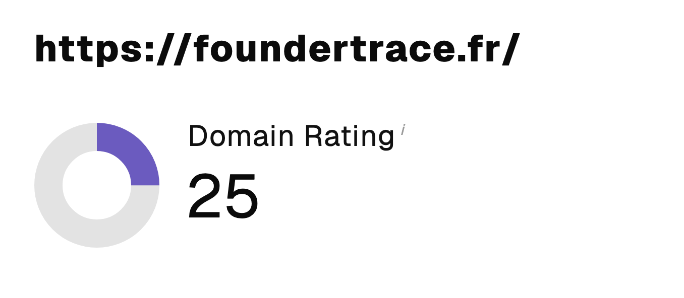 “I just let the Sorank software do its thing, and now my DR is 25 and my page is ranking higher.”
 Lucas Flandrefoundertrace.fr“I specialized in GEO thanks to Sorank. The GEO Leaderboard allows me to show my clients their position vs competitors on ChatGPT. It’s a real commercial differentiator.”
 MélanieSEO Freelance“Great service, works well for our website and helps us understand how to improve it to rank better on Google and elsewhere. Congrats, keep going, I recommend it.”
 Hugo T.E-commerce merchant