Preferences
Privacy is important to us, so you have the option of disabling certain types of storage that may not be necessary for the basic functioning of the website. Blocking categories may impact your experience on the website. More information
Privacy is important to us, so you have the option of disabling certain types of storage that may not be necessary for the basic functioning of the website. Blocking categories may impact your experience on the website. More information

Above the fold content explained: what Google has said, how visitors read the first screen, and a six-step audit to fix the top of your pages today.

In short
Above the fold content is everything a visitor sees before they scroll. Put the direct answer, the topic of the page and one clear next step in that first screen. Google has never published an above-the-fold ranking score, but it changed how it ranks pages with too many ads at the top in 2012, it measures how fast the largest element of that screen appears, and eye-tracking data shows that most attention stays there.
Want to go further? Ask
Quick quiz
Which way of finding customers online fits you best?
Sorank matches your answers


Test it for 3 days on your own site and see where you stand on Google, ChatGPT and the other AIs.
Start 3-day free trial3 days free, then stop whenever you want. 90-day results guarantee, conditions apply.
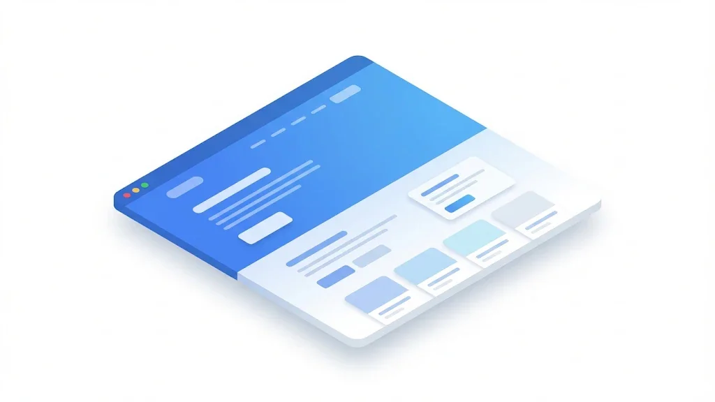
The phrase comes from newspapers. The front page was folded in half, and the headline above the fold was the one that sold the paper. On a website, the fold is the bottom edge of the browser window when the page first loads. Anything above that line is above the fold. Anything below it needs a scroll.
The problem is that the line does not stay still. A laptop at 1920 by 1080 pixels shows far more of a page than a phone at 390 by 844 pixels. Browser toolbars, zoom levels, cookie banners and mobile address bars move the line again. So there is no single fold. There is one fold per device, and each visitor sees a slightly different one.
That is why you should design for the first screen on each device, not for an imaginary average. The work itself is simple. You list what appears in that area, decide what it must say, and test it on real screen sizes. If you already know the basics of on-page SEO, the fold is where those basics become visible to a human.
What the first screen gets
Sources: Nielsen Norman Group, April 2018 (120 participants); web.dev, Largest Contentful Paint
In January 2012, Google announced what it called a page layout algorithm improvement. Matt Cutts wrote the post for Google's Search Central blog. It targeted one pattern: pages that load the top of the page with ads. Cutts wrote that users want to see content right away, "rather than scrolling down the page past a slew of ads". The change applied to sites that dedicate "a large fraction of the site's initial screen real estate to ads", or that go "to an excessive degree" with ads at the top. Pages with a normal amount of above-the-fold ads were not in scope.
Two details matter for you. First, the rule was about ads, not about your own content. Second, the phrase "to an excessive degree" is vague on purpose. The post does not give a percentage. If your first screen is mostly a banner, a pop-up or a block of promotions, you are in the risky zone. If it is a headline, a summary and a few ads, you are not.
What the 2012 update was about
Source: Google Search Central blog, January 19, 2012
In an SEO Office-hours session, John Mueller was asked whether Google still favors content above the fold. Search Engine Journal reported his answer in May 2021. He said: "I don't think we have strong preferences in that regard." He also said: "So the main thing is that we want to see some content above the fold." Then he added: "So it's not purely that the content has to be above the fold. But... some of the content has to be."
Read together, the two statements give you a practical rule. Google does not require your main content to sit in a fixed position. It does expect a visitor to see something useful on arrival. A page with a clear answer in the first screen fits that expectation. A page that opens with a logo, a carousel and a cookie wall does not.
If you need the exact context, the answer is on the recording of that Office Hours session, at about the 55 minute mark according to the Search Engine Journal report. Watch it yourself before you quote it in a client report.
Core Web Vitals do not measure layout. They measure experience. One of them, Largest Contentful Paint (LCP), touches your first screen directly. Google's web.dev documentation on LCP defines it as the render time of "the largest image, text block, or video visible in the viewport". Everything in your first screen competes for that title, and the biggest element usually wins it.
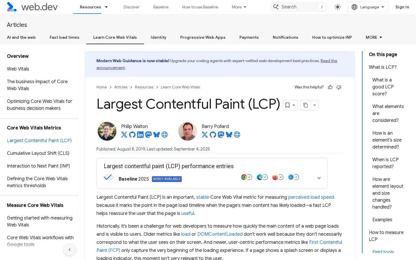
The thresholds are simple. Google's guidance treats an LCP of 2.5 seconds or less as good, between 2.5 and 4.0 seconds as needs improvement, and above 4.0 seconds as poor. The score is based on the 75th percentile of page loads. A fast test on your office connection tells you little about the visitor on a mobile network in a train.
The practical link is this. If your hero image is the largest element and it loads late, the first screen is slow even when the design is good. Section 6 shows how to find that element and fix it.
The table below puts the four signals you can actually check for the first screen side by side. Only one of them is measured by Google. The others are yours to measure.
| Signal | What it tells you | Who measures it |
|---|---|---|
| Main answer visible without scrolling | Whether a visitor can judge the page at once | You, with a screenshot |
| Share of the top taken by ads | Whether the layout matches the pattern Google described in 2012 | You, with a screenshot |
| LCP of the largest element | How long the biggest part of the first screen takes to appear | Google, through web.dev and PageSpeed Insights |
| Scroll depth and time on page | Whether people read past the first screen | Your analytics |
Google's guidance is one side of the story. Users are the other side. In April 2018, the Nielsen Norman Group published the results of an eye-tracking study with 120 participants. The researchers recorded more than 130000 data points on a 1920 by 1080 screen. Their finding was direct: "people still spend most of their viewing time in the top part of a page." Participants spent about 57 percent of their page-viewing time above the fold.
Those numbers come from one study, on desktop screens, in 2018. Treat them as a direction, not a law. The direction still holds for a simple reason. A visitor who arrives from a search result decides within a few seconds whether the page matches what they typed. The first screen is the only part they have seen when they make that decision.
The study shows where attention goes. It does not show where conversions happen. A person can read the top, find the answer and leave, which is a good outcome for an informational page. Another person can scroll for ten minutes and never click a button. So the first screen has to satisfy the search intent, and the rest of the page has to carry the depth. Do not treat above the fold as the whole page.
The study also says nothing about your audience. A B2B buyer comparing suppliers reads differently from a teenager looking up a recipe. Your own data is the only reliable test.
Your analytics show the same pattern, if you look for it. In Google Analytics 4, enhanced measurement sends a scroll event when a visitor reaches 90 percent of the page. Compare the share of visits that fire it on your long articles with the share of visits that reach the end of the page. A low share on a long article means the first screen did not give the reader a reason to continue, or the article is longer than the topic needs. A high share with no clicks means the reader finished the page, and the closing step may need a stronger next action.
Segment by device before you draw any conclusion. Phone visitors often scroll less because the screen is small and the first screen is smaller. A page that looks weak on desktop may be fine on mobile, or the reverse.
Most sites use one of three structures for the first screen. Each one does a different job. None is best for every page, so read the three descriptions, then use the table at the end to choose.
The principle is borrowed from newspapers. The first two sentences answer the query in full. The rest of the page adds the proof, the detail and the edge cases. Use it for informational pages, definitions, how-to guides and comparisons where the reader needs one fact fast.
The advantages are speed for the reader and a clear answer that anyone, including an AI answer engine, can lift from the top of the page. The main limit is tone. It feels dry on a brand page, and it can look thin if the answer is one short sentence with nothing behind it.
Example
A guide on fold heights could open like this: "The fold is the bottom edge of the visible browser window when a page loads. It changes with the device, the browser toolbar and the zoom level." The next paragraph then gives the sizes to test and the reason each one matters.
The principle is a large headline, one supporting line, one image and one button. The first screen sells the outcome. Use it for product, service and landing pages, where the visitor already knows the category and needs a reason to act.
The advantages are a strong brand feel and a clear call to action. The risks are vague claims and a hero image that becomes the largest element on the page. A large image is the most common cause of a slow LCP on marketing pages, so this structure needs the most testing.
The principle is a short box of key points, or a contents list with anchor links, placed right under the headline. Each point links to a section further down the page. Use it for long guides, usually above 3000 words, and for reference pages and documentation.
The advantages are that readers can jump to the part they need, and the box gives search engines and AI tools a clear outline of the page. The limit is length. A long list pushes the content below the fold, and a box that links to every heading defeats its own purpose. Keep it to five or six points.
For guides, the heading structure does most of the work after the first screen. The format guide for blog posts covers how headings, lists and summaries fit together.
| Structure | Best for | Main advantage | Main risk | Effort to test |
|---|---|---|---|---|
| Answer first | Guides, definitions, comparisons | Fast answer for the reader and for AI tools | Feels dry on brand pages | Low |
| Hero with a promise | Product, service and landing pages | Strong brand feel and a clear action | Vague claims and a slow hero image | Medium |
| Summary box with anchors | Long guides, reference pages | Easy navigation and a clear outline | Box pushes content below the fold | Low |
In practice, most strong pages combine two of them. A guide can open with an answer first and add a short summary box after the answer. A product page can use a hero for the offer and a direct answer for the questions below it.
The audit takes about an hour for a page you know well. Start with your ten most visited pages, then move to the rest of the site. The steps below work for a blog article, a product page or a homepage.
The six-step first screen audit
Capture the top of the page at two sizes, for example 1440 by 900 for a laptop and 390 by 844 for a phone. Use a private browser window with no extensions, so an ad blocker or a consent plugin does not hide what a typical visitor sees. Do not trust a design tool preview. It shows the layout without ads, pop-ups, consent banners or the real font loading, which is exactly what you need to see.
Write down each element from top to bottom: logo, navigation, headline, subtitle, image, promotional banner, cookie notice, button and the first body paragraph. Estimate the height of each one in the screenshot. Then ask a simple question. On the phone view, is the first sentence of body text visible? If not, the page pushes its substance below the fold on the device that most of your visitors use.
Show the screenshot to someone who has never seen the site, for five seconds. Hide it, then ask three questions: what is this page about, who is it for, and what should I do next? If they cannot answer all three, the top is not doing its job. Write down the words they use. Those words are often better headline material than the ones your team invented in a meeting.
Open the page in a browser, run a performance test and check which element the browser reports as LCP. Section 6 shows the snippet that prints it. If the element is a hero image, check its file size, its format and whether the browser can start loading it early. If it is a text block, check how the fonts load, because a text block can wait for a font file before it appears.
Put the answer in the first two sentences. Put the topic in the first heading. Put one next step in the first screen, such as a link to the tool, the guide or the offer. Then check the heading structure with a heading analyzer, to confirm the H1 and the first H2 say the same thing in different words.
Record scroll depth, time on page and clicks on the main button for four weeks before the change and four weeks after. Compare like with like: the same traffic sources and a similar device mix. A change that lands in the same week as a campaign is noise, not evidence. If the numbers move in the right direction, apply the same template to the next page type.
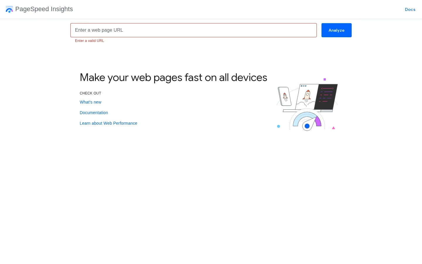
Google's PageSpeed Insights shows two kinds of data for a public URL. Lab data comes from a test run on a standard device. Field data comes from real visitors, when Google has enough of them for the page. Read the field data first, because it reflects your audience. Use the lab data to debug, because it repeats the same test each time.
The browser can tell you which element it counted as LCP. Paste this snippet into the developer console, reload the page and read the last entry. The last entry is the final candidate, so it is the one that matters.
new PerformanceObserver(function (list) {
  var entries = list.getEntries();
  var last = entries[entries.length - 1];
  console.log('LCP', last.startTime, last.element);
}).observe({ type: 'largest-contentful-paint', buffered: true });
The output gives you the time in milliseconds and the DOM element. If the element is your hero image, the fix is usually one of three things: a smaller file, an earlier start, or a reserved space. The HTML below does the last two at once.
<img src="/images/hero.webp" width="1200" height="630" fetchpriority="high" alt="Replacement filters for industrial pumps">The explicit width and height reserve the space before the image arrives, so the text below does not jump when it loads. The fetchpriority attribute tells the browser to request the image earlier than it would by default. Keep the alt text descriptive, because it is the text a screen reader or a crawler reads when the image is missing.
Note
PageSpeed Insights uses the same LCP thresholds as the ones described above. Compare your field number to the 2.5 second target first, then use the lab number to test the fix.
Tip
Before you start the screenshot audit, run any page through the free On-Page SEO Audit Tool to check the basic on-page signals. It takes a minute and tells you whether the first screen is the only problem.
Six mistakes explain most weak first screens. Each one below has three parts: what it is, how to spot it, and how to fix it. Work through them in the order listed, because the first two are the most common and the most costly.
The mistake is a full-width photo or illustration with no text, sized so that it fills the phone view. The first paragraph lands below the fold, and the image becomes the largest element on the page.
To spot it, look at the phone screenshot. If the first sentence of body text is not visible, the image is too tall. Then check the LCP snippet from section 6. If the image is the element it reports, you have both a layout problem and a speed problem.
To fix it, reduce the image height on phones and put the headline and the answer above it. Serve a compressed WebP or AVIF file at the size it is displayed. You can check the weight with an image compressor before you upload. Add the width, height and fetchpriority attributes shown above.
The mistake is a stack of display ads, a promo bar or a newsletter block above the content. This is the pattern Google described in its 2012 update, and it is the one most likely to hurt a page on a phone, where the first screen is small.
To spot it, count the blocks above the first paragraph. The headline and one line of text are fine. A headline, a promo bar, a newsletter block and an ad slot before the text is a warning sign. Check it on a phone, because the same stack takes up more of the screen there.
To fix it, move the first paragraph above the ad slot, or move the slot below the first two paragraphs. Keep the ad density consistent across the page, not just at the top. A page that looks clean at the top and cluttered further down still gives the reader the same experience once they scroll.
The mistake is a consent banner, a chat bubble or a pop-up that sits over the first screen and hides the text. The visitor has to act before they can read, and many leave instead.
To spot it, take the screenshot in a private window, with no consent choice made. Look for any element that covers text, including a chat bubble that sits over the last line of the first screen. Also check what happens when the pop-up is closed. Some sites leave a gray layer behind, which makes the page look broken.
To fix it, use a consent banner that sits at the bottom of the screen on phones and can be closed with one tap. Load the chat widget after a short delay or after the first interaction, so it does not compete with the first paragraph. Test the closed state as well as the open one.
The mistake is a big part of the first screen that waits for a font, a script or a slow image. The visitor sees a blank space, then the content jumps into place. Both the wait and the jump hurt the experience.
To spot it, check the field LCP in PageSpeed Insights. A number above 2.5 seconds is a sign. You can also open the page with a throttled connection in the browser developer tools and watch the first screen fill. If the largest element arrives last, that is the one to fix.
To fix it, preload the critical image, avoid rendering it through JavaScript, and reserve its space with explicit dimensions. For text, check the font loading strategy, so the browser can show a fallback font while the custom font loads. Then run the LCP snippet again and compare the time.
The mistake is a slogan in the H1 that does not name the topic or the offer. The brand voice is clear to the team, but a visitor from a search result cannot tell what the page is for.
To spot it, run the five-second test from step 3. If the test fails, the headline is the first thing to change. Then compare what you wrote with the words people used in the test.
To fix it, name the topic in the H1 and state the answer or the offer in the first paragraph. Keep the brand voice in the tone, not in the first word a visitor reads.
A headline that says nothing, and one that does
The mistake is two or three paragraphs of context, history or general statements before the reader learns anything useful. Writers often add them to sound thorough. Readers skip them, and the first screen ends before the substance starts.
To spot it, read the first hundred words aloud. If the answer has not appeared by the end, the introduction is too long. Also look for generic openers such as "In today's digital landscape", which add nothing and make the reader scroll for the point.
To fix it, move the answer to the first two sentences and move the context below it. A one-line "In short" summary works well for guides. For a long article, add a summary box with anchors, as described in section 4.
Run this checklist on each page type before you publish. It takes less time than rewriting a page after it underperforms, and it catches the problems that section 7 describes.
First screen checklist
Warning
Do not cram every keyword into the first screen. A sentence that answers the question beats a list of terms. The same rule holds for the title and the meta description. If the top reads like a keyword list, neither a visitor nor a search engine will trust it. The general rules for SEO best practices apply to the top of the page too.
The right first screen depends on the page type. A homepage, a product page, a blog article and a category page each have a different job. Set one rule per template, then handle the exceptions. Use the table below as the starting point.
| Page type | What the first screen must show | Typical failure |
|---|---|---|
| Homepage | Who you are, what you offer and where to go next | A slogan with no product named |
| Product or service page | The outcome, the next step and one piece of proof | A hero image with no offer under it |
| Blog article | The direct answer, the topic and a summary or next step | A long introduction and ads above the text |
| Category page | What the category covers and the main filters | Filters that push every item below the fold |
A site with hundreds of pages cannot be audited by hand. Start with the templates. Fix the first screen of each template once, then check the exceptions. This article covers only the top of each page. The full job of writing each page type is covered in our website content writing guide, which goes through every page of a site step by step.
Existing pages are where most weak first screens sit, because they were built before anyone thought about the fold. Sorank's content optimization feature is built to fix and rewrite existing pages on autopilot. For a new page, the LLM readability checker shows how easily an AI tool can extract the answer from your text, which is a useful test for the first two sentences.
Start this week with your five most visited pages. Run the screenshot audit, rewrite the first two sentences, and measure for four weeks. Then move to the next template. The first screen rarely needs a redesign. It usually needs a clearer answer, a smaller image and one fewer banner.
It is everything a visitor sees on a page before they scroll. The fold is the bottom edge of the browser window when the page loads, and it changes with each device, zoom level and browser toolbar. A strong first screen holds the answer, the topic and one clear next step.
Google has not published a direct above-the-fold ranking score. It changed its layout rules for pages with too many ads at the top in 2012, and Core Web Vitals measure how fast the largest visible element loads. The first screen also shapes how long people stay, which you can measure in your own analytics.
Aim for the headline, the direct answer or the first sentence of the body, and one button, all visible on a common phone screen. On mobile the space is small, so a tall banner or a large hero image pushes everything else out of view. Test on a real phone, not only in a design tool.
We analyse your competitors, your website and your AI visibility to create a tailored content plan for free.
 AI Content Brief Generator
 FAQ Schema Generator
 AI Blog Post Ideas Generator
 Structured Data Validator (Schema Validator)
 Alt Text Checker
 Internal Link Analyzer
 Backlink Challenge
 AI Meta Description Generator
 AI Blog Title Generator
 Google Indexability Checker
 AI Blog Outline Generator
 UTM Link Builder
 Keyword Clustering Tool
 Canonical Tag Checker
 XML Sitemap Generator
 Broken Link Checker
 AI SEO Title Generator
 Headline Analyzer
 SERP Preview Tool
 Redirect Checker
 Hreflang Tag Generator
 Heading Structure Analyzer
 HTTP Headers Checker
 Favicon Extractor
 SERP CTR Calculator
 SEO vs Paid Search Savings Calculator
 SEO Share of Voice Calculator
 SEO ROI Calculator
 SEO Traffic and Revenue Forecast Calculator
 SEO Budget Calculator
 SEO Break-Even Calculator
 SaaS SEO ROI Calculator
 ROAS Calculator
 Reading Time Calculator
 Ranking Gain Simulator
 Organic Traffic Value Calculator
 Organic Traffic Estimator and Website Traffic Checker
 LTV to CAC Ratio Calculator
 Local SEO ROI Calculator
 Link Building Cost Calculator
 Keyword Value Calculator
 Keyword Opportunity Score Calculator
 Keyword Density Calculator
 GEO ROI Calculator
 GEO Content Investment Calculator
 Ecommerce SEO ROI Calculator
 Customer Lifetime Value Calculator
 Customer Acquisition Cost Calculator
 CTR Calculator
 Cost Per Article Calculator
 Conversion Rate Calculator
 Content Marketing ROI Calculator
 ChatGPT Referral Traffic Estimator
 Bounce Rate Calculator
 Backlink ROI Calculator
 AI Visibility Score Calculator
 AI Traffic Value Calculator
 AI Share of Voice Calculator
 Cost of AI Invisibility Calculator
 AI Citation Rate Calculator
 llms.txt Validator
 AI Overview Checker and AI Overviews Rank Checker
 Robots.txt Checker
 AI SEO Audit
 LLM Readability Checker
 SearchGPT Readiness Checker
 Structured Data LLM Audit
 Website Crawlability AI Audit
 Why ChatGPT Is Not Recommending My Website
 Gemini Ranking Tool
 Perplexity Ranking Checker
 LLM Citation Checker
 Answer Engine Optimization Audit
 GEO Audit
 AI Search Visibility Test
 ChatGPT Visibility Checker
 llms.txt Generator
 URL Extractor
 Webpage to Markdown
 Sitemap Checker
 SERP Volatility Sensor
 Page Size Checker
 Word Counter
 Slug Generator
 Schema Generator
 Robots Generator
 OG Preview
 Meta Tags Generator
 Image Compressor
 Favicon Generator
 On-Page SEO Audit: SEO Checker and SEO Analyzer
 Backlink Analysis Tool
 Keyword Research Tool
 Domain Authority Checker
 “I tested Sorank on a real client site and it's insane. It does everything an agency would bill you $1500 a month for. It's going into production on that client now.”

 Guillaume Guersanguersanguillaume.com“We are an Ads agency and we wanted to get our SEO back on track once and for all. Sorank gave us a clear view of our site, helped us prioritize optimizations, and properly structure our content. The tool is easy to use, well designed for a team, and very practical for centralizing tracking without having to juggle multiple platforms. A very solid foundation to start fresh with our SEO.”
 Gaspard MadouiAds Agency
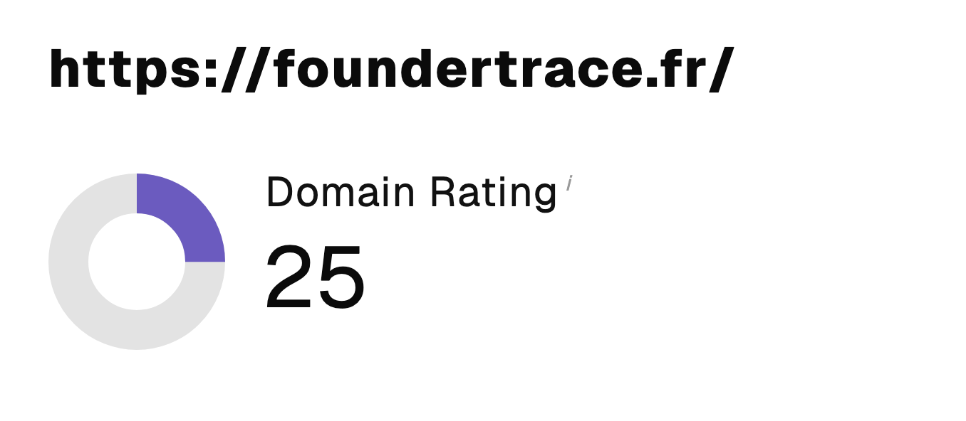 “I just let the Sorank software do its thing, and now my DR is 25 and my page is ranking higher.”
 Lucas Flandrefoundertrace.fr“I specialized in GEO thanks to Sorank. The GEO Leaderboard allows me to show my clients their position vs competitors on ChatGPT. It’s a real commercial differentiator.”
 MélanieSEO Freelance“Great service, works well for our website and helps us understand how to improve it to rank better on Google and elsewhere. Congrats, keep going, I recommend it.”
 Hugo T.E-commerce merchant