
Preferences
Privacy is important to us, so you have the option of disabling certain types of storage that may not be necessary for the basic functioning of the website. Blocking categories may impact your experience on the website. More information
Privacy is important to us, so you have the option of disabling certain types of storage that may not be necessary for the basic functioning of the website. Blocking categories may impact your experience on the website. More information

Build comparison pages that rank: pick the right queries, write a verdict readers trust, link the pages into a cluster, and fix the common mistakes.


Tools

In short
A comparison page answers the question buyers ask right before they choose: "X or Y, which one fits me?" To rank it, build one page per real comparison query, put a clear verdict and a checkable table near the top, back every claim with a source or a test, and link the page into a small cluster so Google and readers can see how the pages relate. Start with three to five comparisons where buying intent is high and where you can answer better than the current top results.
Want to go further? Ask
Quick quiz
Is SEO right for you, and how should you start?
Sorank matches your answers


Test it for 3 days on your own site and see where you stand on Google, ChatGPT and the other AIs.
Start 3-day free trial3 days free, then stop whenever you want. 90-day results guarantee, conditions apply.
A comparison page sets two or more options side by side on one URL and says which option fits which situation. The queries look like "Notion vs Airtable", "Ahrefs alternatives" or "best CRM for small teams". The person typing them is close to a decision, which is why these pages tend to convert better than a general blog post on the same topic.
Ranking them is the same job as ranking any page, with one twist: the reader already knows the category, so the page has to be more specific than the generic guide sitting above it in the results. A comparison that says "both are great tools" loses to a page that names the price, the limits and the situation where each option wins.
Position still decides most of the traffic. Visionary Marketing analyzed 21.7 million Google Search Console impressions covering March 2024 to March 2026 and published average click-through rates by position. These are the overall figures for the whole period:
The gap that matters most right now is the AI Overview effect. The same dataset shows how much position 1 changes depending on whether Google displays an AI Overview for the query:
Position 1 click-through rate, with and without AI Overviews
Source: Visionary Marketing, Google Search Console data, March 2024 to March 2026
Two things follow for a comparison page. First, ranking first is worth less than it used to be, so the page has to earn the click with a clear answer in the snippet and on the first screen. Second, a comparison query is one where people still click through to compare details. This is one dataset from one vendor, so treat it as a direction rather than a law, and measure your own Search Console numbers before you bet a quarter on it.
The closest official guidance is Google's April 2021 post on product reviews. It says people appreciate product reviews that share in-depth research, and it asks whether a review shows what sets a product apart from its competitors. It also warns against thin content that simply summarizes a bunch of products. A comparison page is a review of several products at once, so the same standard applies.
Most comparison queries fall into four patterns. Each one asks for a slightly different page, so pick the pattern before you write a word.
| Type | Typical query | What the reader needs | Example path | Hard part |
|---|---|---|---|---|
| Head-to-head | "X vs Y" | A decision between two known options | /compare/notion-vs-airtable/ | Keeping both sides fair |
| Alternatives | "X alternatives" | A reason to leave a tool they already know | /alternatives/ahrefs/ | Naming rivals you can describe honestly |
| Best for a use case | "best X for Y" | A shortlist for one situation | /best-crm-for-small-teams/ | One clear verdict per use case |
| Category matrix | "X vs Y vs Z" | A map of a whole category | /compare/crm-software/ | Keeping prices and features current |
Head-to-head pages work best when the two options are close enough that the reader is really choosing between them. Alternatives pages suit a category with a clear market leader, where people search for a cheaper or simpler option. Best-for pages rank for specific use cases and need a short, opinionated list. Category matrices are big, which makes them the natural hubs for the other three types, a point we come back to in the linking section.

Not every pair of products deserves a page. Three filters decide it: whether people search for the pair, whether the searchers are close to buying, and whether you can answer better than the pages ranking now.
Start with the queries you already get. In Search Console, open the Performance report, add a Query filter with a custom regular expression, and paste the pattern below. It shows which of your pages already collect comparison traffic, and which comparison queries land on a page that was never built for them.
vs|versus|alternative|alternatives|compare|comparisonThen check the competitors' pages. Search the pair in a private browser window, read the top three results, and note what each one leaves out. If all three are listicles with no table of their own and no checked dates, you have an opening for a page with real tests and a clear verdict.
"Notion vs Airtable" signals a choice. "What is a comparison page" signals a learner. Keep the first kind and treat the second as blog content. Ask one question about each pair: if a reader finishes the page, what do they do next? If the answer is "sign up, buy or book a demo", the page earns its place.
Here is a worked example. Say you sell a project management tool. Four pairs come to mind: your tool against the two biggest names, your tool against a cheap rival, and two pairs of rivals you do not sell. The Search Console filter shows that people search for the first pair and for the alternatives query of the biggest name, while almost nobody searches the rival pairs. You now have two pages to build instead of four, and each has a clear buyer.
Two pages aimed at the same query compete with each other, and Google has to pick one. Before you start, search your own site for the pair and for the query. If a page already covers it, update that page rather than creating a twin. The full mechanics are in our guide to keyword cannibalization.
Qualify a comparison before you write it
A comparison page is read in a hurry. Order the sections the way a buyer asks questions: the answer first, then the evidence, then the detail, then the doubts. The table below lists the parts that do the most work.
| Section | Job for the reader | What good looks like |
|---|---|---|
| Verdict | Answers the query in the first screen | Two sentences: who should pick which option, and why |
| Comparison table | Shows the criteria at a glance | Six to ten rows, each one checkable, with the date you checked |
| Detailed criteria | Explains the rows that matter most | One short section per criterion, with a test or an example |
| Strengths and limits | Shows where each option loses | At least two real limits per option, written as facts |
| Who each option fits | Turns the comparison into a decision | A named situation for each side, rather than "for everyone" |
| FAQ | Catches the last doubts | Three questions people really type, answered in two or three sentences |
Put the answer above the table. "Choose Notion if you want one workspace for notes and projects. Choose Airtable if your team works in shared databases with many views." The reader now knows the page answers the question, and the table below becomes evidence rather than a puzzle to solve.
A row that says "easy to use" cannot be checked, so it adds no trust. A row that says "free plan: up to a fixed number of records" can be checked by the reader in two minutes. Use units, limits and the exact names of the plan tiers. Under the table, write the date you checked the prices and the method you used. Pricing changes often, and an undated price is the first thing a skeptical reader will doubt.
Design the table for a phone too, because many readers look at comparisons there. Keep the first column as the criterion, limit the table to three options at most, and move extra detail below it. If you need to compare more options, split the content into two pages by use case rather than squeezing every option into more columns.
Every tool has a weak spot, and naming it is what makes the rest of the page believable. For each option, write two or three limits as plain facts: a feature missing on the lower plan, a workflow that slows down at scale, a region or language that is not supported. Do not write limits as insults. "No offline mode on the free plan" is a limit. "Clunky" is an opinion with nothing behind it.
Close each comparison with a short "who should choose" block for each side. The more specific the situation, the better the page fits the query. "A solo consultant who needs invoices and a calendar" beats "small businesses", because the first reader recognizes themselves and the second reader does not.
Here is the method we would follow for one head-to-head page. A first page takes a few hours, and much less once the template exists.
Six steps from query to published page
For the first step, write the target query into a sheet before you write any copy. For the fourth, keep the rows in the same order on every comparison you publish, so a reader who has read one can scan the next. For the last step, the URL and the title should follow one pattern across the whole set:
URL:    /compare/notion-vs-airtable/
Title:  Notion vs Airtable: Features, Pricing and Who Each Is For
Meta:   Which tool fits which team, with the prices we checked and the date
On the second step, rank your sources before you use them. The vendor's own pricing and documentation pages come first, because they describe the terms a buyer will actually pay under. A trial of the product comes second, since it shows what the documentation leaves out. Reviews and forum threads come last. Use them to find the limits people complain about, then check each complaint yourself before you repeat it. A limit you can reproduce is worth more than a quote from a stranger.
Tip
Write for the reader who has already shortlisted both options. If your first paragraph would make sense to someone who has never heard of either tool, cut it and start with the verdict.
Once you have several comparison pages, the links between them decide how Google understands the group and how readers move from one page to the next. There is no single correct pattern. Three methods are common, each fits a different kind of site, and each has its own cost. We present all three so you can choose on purpose.
Principle. Every page links to the related pages it mentions, in context, and the links run in both directions. Nothing is organized by folder or hierarchy. The structure comes from the text itself.
When to use it. A small site with fewer than about twenty comparisons, where each page naturally mentions two or three others.
Advantages. It is the least work, it reads naturally, and it spreads links to every page through the running text.
Limits. Without rules it turns into a tangle. Pages link to whatever they mention, so your most important page may receive no more links than a minor one, and it becomes hard to see which page should rank for which query.
Example. Your "Notion vs Airtable" page mentions Coda and ClickUp, so it links to both comparison pages, and each of those links back where it mentions Notion.
Principle. One broad pillar page covers the category, and the specific comparisons are the spokes. Each spoke links to the pillar, and the pillar links to each spoke. Our glossary has a full definition of a topic cluster.
When to use it. A category with many comparisons, where one page can sensibly summarize the whole field and link to the detail.
Advantages. The pillar gathers the broad query, each spoke targets one specific query, and the structure is easy to explain to a writer or a client.
Limits. The pillar has to stay strong, or the whole cluster looks weak. A spoke that drifts into the pillar's query creates the overlap described above.
Example. A "CRM software" pillar links to "HubSpot vs Pipedrive", "Pipedrive alternatives" and "best CRM for small teams", and each of those links back to the pillar.
Principle. Every comparison lives under one folder, such as /compare/, and the folder has its own hub page. Links stay mostly inside the folder, so the address itself shows which pages belong together.
When to use it. A large set of comparisons that share one template, where readers and crawlers benefit from a clear address structure.
Advantages. The structure is visible in the URL, it is easy to audit, and the folder can be reviewed as one unit.
Limits. The folder alone does not connect the pages. You still need the hub and the in-text links, and a folder that mixes unrelated pairs sends a weak signal.
Example. All pairs live under /compare/, and the hub at /compare/ lists them grouped by category.
| Method | How links flow | Best when | Main risk | Effort |
|---|---|---|---|---|
| Wikipedia pattern | In-text links between related pages, in both directions | Fewer than about twenty pages | Unclear which page should rank for which query | Low |
| Topic cluster | Spokes link to a pillar, and the pillar links back | A category with many pairs | A weak pillar drags the whole cluster down | Medium |
| URL folder silo | Links stay inside one folder under a hub | Large sets that share one template | A folder without real links between its pages | Medium to high |
Which method should you pick? Start with the Wikipedia pattern if you have a handful of pairs, because it costs almost nothing to try. Move to a topic cluster once a category has several pairs and a clear overall query, because the pillar then gives the cluster a home. Use the folder silo when the set is large and built from one template, because the address structure keeps it easy to audit. Most mature sites end up with a mix: a folder for the set, a pillar for each category, and in-text links between closely related pairs.
Whichever pattern you choose, anchor text matters. Google's guidance on links says that paying more attention to the anchor text used for internal links can help both people and Google make sense of your site. Write "see our Airtable comparison" rather than "click here", and do not repeat the exact same phrase on every link. For a broader plan, read our guide to internal linking strategy, and for the keyword side of grouping, our explanation of keyword clustering.
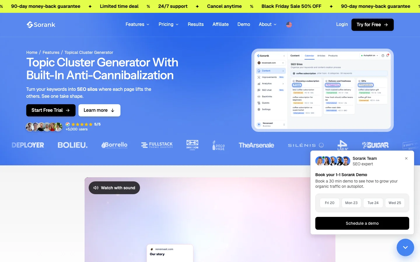
A tool can keep the clusters clean. Sorank's Topical Cluster Generator groups keywords into themed silos under a pillar, and it runs an anti-cannibalization check while it builds the clusters, so two spokes do not end up competing for the same query. Its public page describes the result as clean clusters with no overlapping pages. The page does not say that it writes the links between pages, so plan those yourself and check them afterwards.
A comparison page that only praises your product loses trust quickly, and the reader leaves to find a fairer one. Fairness is what makes the page worth reading. Four habits make the difference.
Name the rival's strengths. If the other option is cheaper, faster or better at one job, say so in the table, where every reader can see it.
Show your weighting. Explain which criteria matter most for which buyer. A reader who cares most about price can then reach their own verdict, and trust your page more for it.
Disclose your stake. If you sell one of the options, say so at the top. A disclosed stake is a trust signal, while a hidden one is a problem waiting to be found.
Date the claims. Write the checked date next to prices and features, and set a reminder to recheck them.
A single page that compares your product with eight rivals can look thorough, but each row ends up shallow. One page per rival lets you answer each query in depth. The trade-off below is our recommendation rather than a measured result.
One page for many rivals, or one page per rival
This is different from a landing page. A landing page sells one option to someone who has already decided to look at it, and our guide to landing pages covers how they are built. A comparison page informs the choice, and the landing page is where that choice gets converted. Keep the two jobs apart, or the comparison starts to read like an advertisement.
Most weak comparison pages fail for one of five reasons. Each one leaves a sign you can spot in an afternoon, and each has a fix you can apply the same week.
A thin summary page, before and after the rewrite
What it is. A page that repeats each vendor's feature list without adding a single fact of your own. Google's product reviews guidance warns against content that simply summarizes a set of products.
How to spot it. Open the page and count the facts you could not find on the vendors' own sites. If there are none, the page is thin, and readers will notice before Google does.
How to fix it. Add one test, one measurement or one real use case per option. A dated screenshot of a pricing tier is enough to start, and the rest can follow over the next updates.
What it is. The same description copied across many comparison pages, often generated from a template with only the product names changed.
How to spot it. Export your meta descriptions and sort them. Any group of identical or near-identical lines is a problem. Google's guidance on snippets is direct: identical or similar descriptions on every page of a site aren't helpful.
How to fix it. Write each description around the decision that page helps with: who should pick which option, and the date the prices were checked.
What it is. Two comparison URLs that both show up for the same search. Google has to choose between them, and often neither ranks as well as one strong page would.
How to spot it. In Search Console, filter a query and look at the pages that receive its clicks. Two URLs taking turns over several weeks is the classic sign.
How to fix it. Merge the weaker page into the stronger one and redirect the old address, or change the weaker page's target to a different, more specific query.
What it is. A comparison page that no other page on your site links to. It can only be found through the sitemap or by luck.
How to spot it. Crawl your site, or use a tool that lists pages with no internal links pointing to them. Google's link guidance is clear that every page you care about should have a link from at least one other page on your site.
How to fix it. Link each page from its category hub and from at least two related articles, using the anchor text a reader would naturally use.
What it is. A table with prices or plan names that changed months ago. It is the fastest way to lose a reader who was about to buy.
How to spot it. Look for any price with no checked date, and for any plan name you cannot find on the vendor's pricing page today.
How to fix it. Put a review date on every page, and recheck the prices on that date. Update the verdict if a price change flips the choice for any buyer.
Warning
Do not disparage a rival with claims you cannot show. An unsupported attack costs more trust than a fair page ever earns back, and it gives the rival an easy story to tell.
A comparison page is not finished when it is published. Prices change, rivals release features, and new queries appear. Set a review rhythm and track three things: the queries each page receives, whether a second page of yours starts taking the same query, and whether the page is still linked from the places that matter.
A simple monthly routine covers most of it:
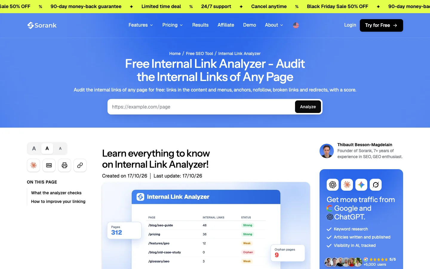
The link check is quick to run by hand, and a free tool can do the first pass. Paste a comparison URL, read the list of internal links it contains and receives, and compare that list with the links you planned.
Tip
Run the free Internal Link Analyzer on your hub page and on each comparison. Any page that receives no internal links shows up at once, and you can fix it the same day.
These are the questions people ask most often when they build their first comparison pages. The short answers also make a good checklist before you publish.
A comparison page puts two or more options side by side and says which one fits which situation. It targets queries such as "X vs Y" or "X alternatives", where the searcher is close to choosing. A good one leads with a verdict, uses a checkable table, and lists real limits for each option.
Yes, as long as every claim is factual and you can show it. Describe each rival's strengths honestly, date your prices, and disclose if you sell one of the options. Avoid any claim you cannot back up.
Start with three to five, chosen from real searches with buying intent where you can answer better than the current top results. Add more once you can see which pages earn clicks and which ones need updates.
Before you publish a comparison page
A comparison page puts two or more options side by side and says which one fits which situation. It targets queries such as "X vs Y" or "X alternatives", where the searcher is close to choosing. A good one leads with a verdict, uses a checkable table, and lists real limits for each option.
Yes, as long as every claim is factual and you can show it. Describe each rival's strengths honestly, date your prices, and disclose if you sell one of the options. Avoid any claim you cannot back up.
Start with three to five, chosen from real searches with buying intent where you can answer better than the current top results. Add more once you can see which pages earn clicks and which ones need updates.
We analyse your competitors, your website and your AI visibility to create a tailored content plan for free.
 AI Content Brief Generator
 FAQ Schema Generator
 AI Blog Post Ideas Generator
 Structured Data Validator (Schema Validator)
 Alt Text Checker
 Internal Link Analyzer
 Backlink Challenge
 AI Meta Description Generator
 AI Blog Title Generator
 Google Indexability Checker
 AI Blog Outline Generator
 UTM Link Builder
 Keyword Clustering Tool
 Canonical Tag Checker
 XML Sitemap Generator
 Broken Link Checker
 AI SEO Title Generator
 Headline Analyzer
 SERP Preview Tool
 Redirect Checker
 Hreflang Tag Generator
 Heading Structure Analyzer
 HTTP Headers Checker
 Favicon Extractor
 SERP CTR Calculator
 SEO vs Paid Search Savings Calculator
 SEO Share of Voice Calculator
 SEO ROI Calculator
 SEO Traffic and Revenue Forecast Calculator
 SEO Budget Calculator
 SEO Break-Even Calculator
 SaaS SEO ROI Calculator
 ROAS Calculator
 Reading Time Calculator
 Ranking Gain Simulator
 Organic Traffic Value Calculator
 Organic Traffic Estimator and Website Traffic Checker
 LTV to CAC Ratio Calculator
 Local SEO ROI Calculator
 Link Building Cost Calculator
 Keyword Value Calculator
 Keyword Opportunity Score Calculator
 Keyword Density Calculator
 GEO ROI Calculator
 GEO Content Investment Calculator
 Ecommerce SEO ROI Calculator
 Customer Lifetime Value Calculator
 Customer Acquisition Cost Calculator
 CTR Calculator
 Cost Per Article Calculator
 Conversion Rate Calculator
 Content Marketing ROI Calculator
 ChatGPT Referral Traffic Estimator
 Bounce Rate Calculator
 Backlink ROI Calculator
 AI Visibility Score Calculator
 AI Traffic Value Calculator
 AI Share of Voice Calculator
 Cost of AI Invisibility Calculator
 AI Citation Rate Calculator
 llms.txt Validator
 AI Overview Checker and AI Overviews Rank Checker
 Robots.txt Checker
 AI SEO Audit
 LLM Readability Checker
 SearchGPT Readiness Checker
 Structured Data LLM Audit
 Website Crawlability AI Audit
 Why ChatGPT Is Not Recommending My Website
 Gemini Ranking Tool
 Perplexity Ranking Checker
 LLM Citation Checker
 Answer Engine Optimization Audit
 GEO Audit
 AI Search Visibility Test
 ChatGPT Visibility Checker
 llms.txt Generator
 URL Extractor
 Webpage to Markdown
 Sitemap Checker
 SERP Volatility Sensor
 Page Size Checker
 Word Counter
 Slug Generator
 Schema Generator
 Robots Generator
 OG Preview
 Meta Tags Generator
 Image Compressor
 Favicon Generator
 On-Page SEO Audit: SEO Checker and SEO Analyzer
 Backlink Analysis Tool
 Keyword Research Tool
 Domain Authority Checker
 “I tested Sorank on a real client site and it's insane. It does everything an agency would bill you $1500 a month for. It's going into production on that client now.”

 Guillaume Guersanguersanguillaume.com“We are an Ads agency and we wanted to get our SEO back on track once and for all. Sorank gave us a clear view of our site, helped us prioritize optimizations, and properly structure our content. The tool is easy to use, well designed for a team, and very practical for centralizing tracking without having to juggle multiple platforms. A very solid foundation to start fresh with our SEO.”
 Gaspard MadouiAds Agency
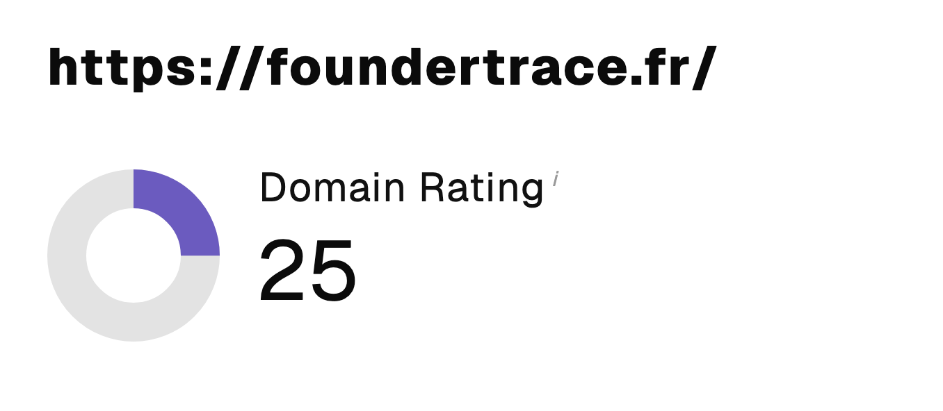 “I just let the Sorank software do its thing, and now my DR is 25 and my page is ranking higher.”
 Lucas Flandrefoundertrace.fr“I specialized in GEO thanks to Sorank. The GEO Leaderboard allows me to show my clients their position vs competitors on ChatGPT. It’s a real commercial differentiator.”
 MélanieSEO Freelance“Great service, works well for our website and helps us understand how to improve it to rank better on Google and elsewhere. Congrats, keep going, I recommend it.”
 Hugo T.E-commerce merchant