Preferences
Privacy is important to us, so you have the option of disabling certain types of storage that may not be necessary for the basic functioning of the website. Blocking categories may impact your experience on the website. More information
Privacy is important to us, so you have the option of disabling certain types of storage that may not be necessary for the basic functioning of the website. Blocking categories may impact your experience on the website. More information

A lead magnet is a free offer traded for an email address. Learn how to pick the topic, build the landing page, deliver it, follow up and measure results.


In short
A lead magnet is a free, genuinely useful asset that you give in exchange for someone's email address. It works when it solves one specific problem for one specific buyer, delivers a usable result within minutes, and sits on a landing page that states exactly what the reader gets. Use the 6.6% median landing page conversion rate from Unbounce's 2024 benchmark as a starting point, not a promise, then raise your rate by sharpening the promise and matching the offer to the traffic you already have.
Want to go further? Ask
Quick quiz
Which way of finding customers online fits you best?
Sorank matches your answers


Test it for 3 days on your own site and see where you stand on Google, ChatGPT and the other AIs.
Start 3-day free trial3 days free, then stop whenever you want. 90-day results guarantee, conditions apply.
A lead magnet is a free offer that you trade for contact details. The usual trade is an email address, but it can also be a name, a company name or a phone number. The "lead" is the person who has shown interest and can now be contacted again. The "magnet" is the asset that pulls them into your form.
The exchange has to feel fair. The reader gives you an address and some of their attention, so the file must be worth more to them than that costs. If it is not, they unsubscribe at the first email, or they never open the email at all.
A lead magnet is not a newsletter box with the words "subscribe for updates" on it. It is not a generic ebook that nobody asked for. And it is not a trick. If the landing page promises twenty templates and the download contains three, you lose the reader and damage the brand's credibility in the same move.
A lead magnet is one of several offers you can put in front of a visitor. The table compares it with the three most common alternatives on the four criteria that matter when you choose.
| Offer | What the visitor gives | Lead quality | Time to first value | Best for |
|---|---|---|---|---|
| Lead magnet (checklist, template, guide) | Email, sometimes a name or company | Medium to high when the topic matches the buyer's problem | Minutes | Top and middle of the funnel, B2B and B2C |
| Newsletter sign-up | Low to medium, often broad interest | Days, when the next issue arrives | Building an audience for an editorial brand | |
| Free trial | Email, account, sometimes a card | High intent, but costly to serve | Hours to days | Software with a clear first success |
| Demo request | Name, company, role, phone | Very high, but few per month | Days to weeks | Complex or high-value products |
Lead magnets sit in the middle. They capture interest earlier than a demo request and give you a stronger signal than a generic newsletter sign-up. That middle position is often where the most useful leads come from, because someone who downloads a checklist is already working on the problem your product solves.
People rarely buy on their first visit. They compare options, read a few pages and come back later. A lead magnet gives them a reason to leave an address while they are still researching, which is the moment when a relationship has the most room to grow.
The clearest public benchmark is the 2024 Conversion Benchmark Report from Unbounce. It reports a median landing page conversion rate of 6.6% across all industries, drawn from more than 41000 landing pages. That number tells you what average looks like. It does not tell you what you should get. A page with a sharp promise, a short form and traffic that searched for the same problem can beat it. A page with a vague headline and a long form often lands below it.
What the benchmark says about landing pages
Source: Unbounce, 2024 Conversion Benchmark Report
Do the arithmetic before you build anything. If your landing page gets 2000 visits a month and converts at 6.6%, you get about 132 sign-ups a month. At 3%, you get 60. That gap is usually created by the headline, the number of form fields and the match between traffic and offer, not by the colour of the button.
The promise. The headline should name the outcome and the format, for example "A one-page checklist to fix the technical SEO errors that block indexing." A reader who understands the result in five seconds is far more likely to fill in the form.
The form. Every extra field is a reason to leave. For a first download, ask for the email address and, if your sequence needs it, a first name. Ask for company size, job title or phone number later, inside the email sequence, once the reader has already received value from you.
The traffic match. A lead magnet promoted to people who searched for the problem converts better than the same file promoted to a general audience. A visitor who arrives from an article about the topic is already interested. A visitor who sees the offer in a generic sidebar may be curious, and may never need it.
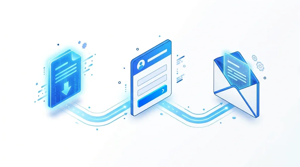
Most lead magnets fall into one of eight formats. Each one fits a different stage of the buyer's journey and costs a different amount of time to produce. Below, each format follows the same five parts: what it is, when to use it, its advantages, its limits and an example. The table at the end compares all eight side by side.
What it is. A one-page list of actions with boxes to tick, such as a pre-launch checklist for an online store.
When to use it. The reader has a process to run: an audit, a launch, a migration or a monthly routine.
Advantages. Cheap to make, fast to read and easy to act on. The reader gets a result in minutes, which makes the first impression strong.
Limits. A generic checklist looks like every other checklist, and it is easy to copy. The value has to come from the specific steps and their order, not from the layout.
Example. A 12-point technical checklist that tells a marketing manager what to fix first, in what order, and how to confirm each fix in Search Console.
What it is. A file the reader fills in or copies, such as a content brief, a budget sheet or an outreach email.
When to use it. The reader has to produce the same document again and again, and a good starting point saves them an hour each time.
Advantages. High perceived value. The template lives inside the reader's daily work, so your brand appears each time they use it.
Limits. It must be flexible enough for other companies. A template that only works with your product feels like a sales tool, and readers stop using it.
Example. An eight-field content brief with a worked example for a fictional product. Our content brief guide explains what each field should contain, which is the material you need to write the template well.
What it is. A survey, dataset or analysis that nobody else has published.
When to use it. You have data from your own product or customers, or you can run a survey with enough respondents to say something useful. Plan the method before you collect a single answer.
Advantages. The strongest authority signal of the eight. Journalists and other sites can cite a unique dataset, which can bring backlinks as well as leads.
Limits. Expensive and slow. Weak data, or a method you cannot explain, damages trust faster than any other format.
Example. A survey of marketing managers about the tools they use to report on SEO, with the anonymised raw data available as a spreadsheet.
What it is. A form that turns the reader's inputs into a result, such as an estimated saving, a return or a score.
When to use it. The reader wants their own number before they decide, and your product's value depends on numbers.
Advantages. The result is personal, which makes people share it and come back. The inputs also tell you what the lead cares about.
Limits. Costly to build and to maintain. If the formula is wrong, the reader notices, and the damage lands on your brand, not on the tool.
Example. The free calculators in our SEO tools section, such as the conversion rate calculator, follow this pattern: the reader enters their own figures and gets a result in seconds.
What it is. Three to seven short lessons delivered by email over one or two weeks.
When to use it. The skill needs practice over time, or the product needs a proper onboarding.
Advantages. Each email is a touchpoint, so the relationship grows quickly. Five lessons also give you five chances to show how you think.
Limits. Heavy to produce and to maintain. Drop-off after the second or third lesson is normal, so write each lesson so it stands on its own.
Example. Five days, one SEO task per day, each lesson ending with a single action on the reader's own site.
What it is. A set of questions that gives the reader a score, a level or a profile.
When to use it. Your audience has different levels, and the result can point to a clear next step.
Advantages. The reader selects themselves, and the answers tell you who the lead is and what they need. Segmenting the list from day one saves work later.
Limits. The scoring must rest on real criteria. A fake result, or a score that always gives the same answer, reads as a trick.
Example. A ten-question assessment that scores how well a site is set up for search and AI answers, with one recommended next action for each score band.
What it is. An excerpt, a chapter, a sample report or a preview of a paid lesson.
When to use it. The paid asset is large, and the reader wants to judge its quality before they hand over an address or a payment.
Advantages. It removes doubt by showing the real product, and it sets the tone for the paid offer.
Limits. The sample must end with a clear next step. If the free part answers everything, the reader leaves with the free part and nothing more.
Example. The first chapter of a paid guide, followed by the full table of contents and a link to the complete version.
What it is. A percentage or an amount off the first purchase, given in exchange for an email address.
When to use it. The buying decision is short and price-driven, as in e-commerce or subscription boxes.
Advantages. It converts quickly, and the value is easy to understand at a glance.
Limits. It attracts people who want the discount rather than the product. It can also teach your list to wait for offers before they buy.
Example. A first-order discount sent in a welcome email, with a clear expiry date and one product category it applies to.
| Format | Production effort | Perceived value | Lead quality | Best stage |
|---|---|---|---|---|
| Checklist | Low | Medium | Medium | Top and middle |
| Template | Low to medium | High | Medium to high | Middle |
| Original research | High | Very high | High | Top |
| Calculator or tool | High | High | High | Middle to bottom |
| Email course | High | Medium to high | High | Middle |
| Quiz | Medium | Medium | High, self-selected | Top |
| Free sample | Low to medium | Medium | Medium to high | Middle to bottom |
| Discount | Low | Medium | Low to medium | Bottom |
The ratings are judgments about how each format usually performs, not measured data from a test, so use them to narrow your shortlist and then test. Start with the format your team can produce well in two weeks. A good checklist beats an unfinished research report. You can build the research later, once the first asset has proved which topic your readers care about.
The best lead magnet is one your ideal buyer would want even if they never bought from you. That sounds like a loss, but it works the other way. An asset that solves a real problem attracts people who will later need your product. An asset on an interesting side topic attracts people who will never pay.
Collect three inputs. First, the questions prospects ask on sales calls and in support tickets. Second, the searches that already bring visitors to your site, which you can see in Search Console. Third, the objections your sales team hears most often. A topic that appears in all three is a strong candidate. Keyword research tools, such as the approach described on our automated keyword research page, show how many people search for each problem and how they word it.
Before you commit, answer three questions about the topic:
If one answer is no, change the topic before you write a line. The most common failure is a strong asset on the wrong problem, which produces a list of people who will never buy.
Same topic, two promises
Broad topics convert less well than narrow ones. A broad title attracts a crowd. A narrow one attracts the person who needs the answer this month. Narrow is harder to write and easier to convert. If you are unsure, write three titles and ask five prospects which one they would download. Their answers will be more useful than your guess.
Gating means the full asset sits behind a form. Open means anyone can read it. Most good lead magnets use both: a public page explains the topic and the outline, and the complete file sits behind the form. Our guide on gated content covers when to gate in general. This section applies those choices to the lead magnet itself.
Where to put the content
Google cannot fill in your form, so a file that sits behind one does not rank. Google's Search Central documentation on paywalled content also covers registration walls. If users must register to see content you want indexed, you can mark up the gated section. You set isAccessibleForFree to false and point cssSelector at the class of the gated block. The documentation says this markup helps Google tell paywalled content apart from cloaking, which its spam policies prohibit.
Warning
Mark up only what is really behind the gate, and keep the markup in line with what the reader actually sees. Google's guidance also recommends a paywall setup that does not send the gated content to the browser at all, if you do not want it reachable at serving time.
{"@context": "https://schema.org", "@type": "WebPage", "isAccessibleForFree": "False", "hasPart": {"@type": "WebPageElement", "isAccessibleForFree": "False", "cssSelector": ".lead-magnet-gate"}}Add this to the landing page, and wrap the gated block in an element with the class lead-magnet-gate. Validate the markup with a structured data testing tool before you rely on it.
The landing page should carry the topic in plain text: the problem, the outline of the asset with its headings, an excerpt or sample page, who wrote it, and the two or three questions it answers. That text is what search engines index and what a reader uses to decide. It is also the part that AI assistants can read when someone asks about the topic. For the anatomy of a page like this, see our guide to landing pages.
A checklist or template can be ready in about a week, depending on your team. A research report takes longer. The steps below work for any format, and each one ends with a decision you can check before you move on.
The lead magnet method in six steps
Write the reader in one sentence: job title, company type and the situation they are in right now. Then write the problem in one sentence, in their words, not yours. If you need two sentences to explain either one, the scope is too wide. Decision: can you name the reader and the problem without using the word "and"?
Use the pattern "Get [outcome] with [format] in [time]". For example: "Get a one-page checklist that fixes the technical SEO issues blocking your indexing, in 30 minutes." Writing the promise first keeps you honest, because every claim in it becomes a requirement for the file. Decision: for each claim, can you point to the part of the file that proves it?
The asset must be complete enough to use, and short enough that the paid product still makes sense. A good test is that the reader finishes with a result and still needs your help for the next level. For a checklist, every item needs an action, a how-to and a way to confirm it. For a template, every field needs an instruction and an example. For research, the method, the sample size and the raw numbers all belong in the file.
Design matters less than clarity, but a messy file lowers trust. Use one font family, two colours at most, generous spacing and clear headings. Many readers open a checklist on their phone first, so check the file on a phone and on a laptop. Ready-made layouts save time. Canva, for example, offers templates for checklists, worksheets and guides, and exports to PDF. Use your brand colours, but keep the file readable when it is printed in black and white.
Create the form in whatever tool your team already uses. Google Forms is free, quick to set up and exports responses to a spreadsheet. The form needs one required field, the email address. Put the download link in the confirmation message, so the reader gets the file the moment they submit, then send the same link by email through your email tool, so it is easy to find later.
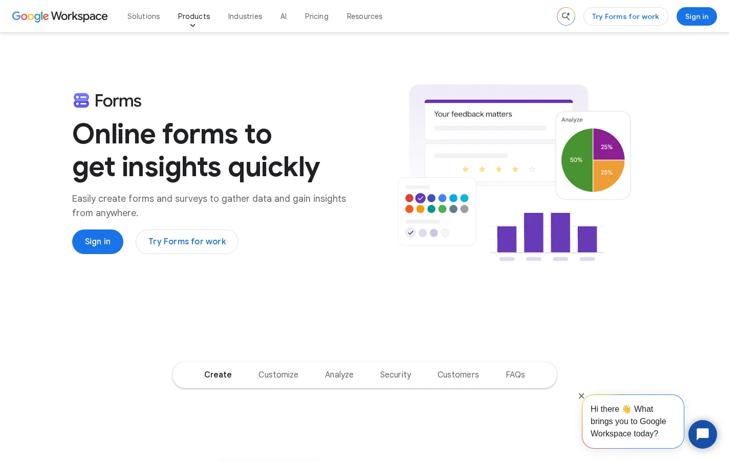
A lead magnet with no traffic is a PDF on a server. Plan the first 30 days before launch. Link to the landing page from the articles that already cover the topic, add a clear block on your highest-traffic pages where it fits, and share it where your readers already spend time. Our guide on content distribution strategies has a channel-by-channel plan you can reuse. Decision: have you named at least three places where the reader will see the offer this month?
The landing page does the selling. The file only delivers what the page promised. Most of the conversion work happens in four places: the headline, the proof, the form and the line under the button.
Name the result and the format in the first line. "Free guide" is a format with no result. "A free checklist to audit your site's crawl errors in 30 minutes" is a result, a format and a time. Use the same words in the title tag and the H1, so the page matches the search query and the offer. If you are choosing the tool to build the page, our comparison of the best landing page software lists the options by use case.
Ask for the email address first. Add a first name only if your email sequence uses it. Leave company size, job title and phone number for later. Name the action on the button. "Send me the checklist" is clearer than "Submit", because the reader knows exactly what they will get.
Show who made the file and why they can speak about the topic. Describe what is inside, with the number of pages, steps or templates. Show a preview, such as a cropped image of the first page or a short excerpt. Specific details make the promise believable. Vague ones make the reader wonder what they are missing.
Add one sentence about the address: where the file is sent, how often you will write, and how to unsubscribe. The sentence reduces doubt, and in the EU it is part of collecting consent properly, as the next section explains. For a conversion checklist on the page itself, our guide to how to increase conversion rate lists the levers in order of impact.
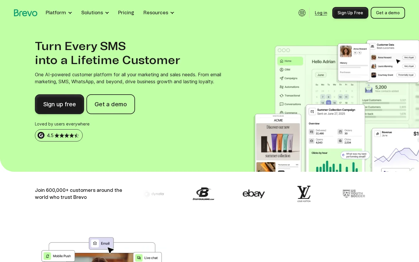
The sign-up is the start of the relationship, not the end of the funnel. The first email delivers the file within a minute. The emails after it help, without selling too early. Our guide to email marketing automation shows how to set up these workflows. Email tools such as Brevo cover the sign-up forms, the welcome sequence and the sending in one place.
| Timing | Content | Goal | |
|---|---|---|---|
| 1 | Immediately | The download link and the one thing to do first | Delivery |
| 2 | Day 2 | A practical tip taken from the asset | Value |
| 3 | Day 4 | A real example or the most common mistake on the topic | Trust |
| 4 | Day 7 | A clear offer for the next step, such as a call or a trial | Conversion |
Keep the sequence at four emails until you know which one earns clicks. Each email should have one main link, one action and a sender name the reader recognises.
If you collect email addresses from people in the European Union, the GDPR applies. Article 7 of Regulation (EU) 2016/679 sets the conditions for consent. Under Article 7(2), the request for consent must be presented clearly distinguishable from the other matters. In practice, the newsletter opt-in should be its own unticked checkbox, not a pre-ticked box buried in the terms. Article 7(4) asks whether a service depends on consent to processing that the service does not need. So the download itself should not require a marketing opt-in that the delivery does not need. Article 7(1) adds that you must be able to demonstrate that consent was given, so keep a record of each sign-up with its date and the form used.
Note
This is general information, not legal advice. Check the rules that apply in each country where your readers live, and ask your legal or privacy contact to review the sign-up text.
A lead magnet is only useful if you know what happens after the download. Track four things: the landing page conversion rate, the cost per lead, the engagement across the welcome sequence, and the rate at which leads turn into real conversations with your team. Set up conversion tracking in your analytics first, as our guide on conversion tracking explains, so the sign-up is counted from the first day.
Conversion rate = sign-ups / landing page visits x 100Cost per lead = (production hours x hourly cost + promotion spend) / sign-upsTake an example. You spend 40 hours producing the asset at 50 per hour, plus 200 of promotion spend, and you get 150 sign-ups. The cost per lead is (2000 + 200) / 150, which is about 14.67. That number only means something when you compare it with what a lead is worth to your business, and you know that figure better than any benchmark does.
Tip
Run your own numbers with the free Conversion Rate Calculator before you set a target. Enter your visits and sign-ups, then compare your rate with the 6.6% median, keeping in mind that it covers all industries.
| Metric | How to measure it | What a warning sign looks like |
|---|---|---|
| Landing page conversion rate | Sign-ups divided by visits, per page and per traffic source | Search traffic converts far below social traffic, which points to a promise mismatch |
| Cost per lead | The formula above, per asset and per channel | Cost per lead above what a lead is worth to your sales team |
| Welcome sequence clicks | Email tool report, per email | A steep drop after the first email, which points to a weak file or slow delivery |
| Lead to conversation | CRM stage or booked calls | Many sign-ups and no reply to the follow-up |
Set the date when you launch. At 90 days, decide: keep the asset as it is, change the headline or the form, or retire it. Retire the asset when the problem it solves has changed. Your sales calls will show that change before the numbers do.
Most lead magnets that fail make one of the seven mistakes below. Each one shows what it looks like, how to spot it in your data or your inbox, and how to correct it.
What it is. A broad title, such as "The complete guide to marketing", that tries to serve everyone.
How to spot it. Ask someone outside the team what the file helps them do. If they cannot answer in one sentence, the offer is too broad. Broad offers also bring sign-ups from people who never match your buyer.
How to fix it. Narrow it to one reader and one problem, then rewrite the title around the outcome. A small asset that answers one question well beats a big one that answers nothing in particular.
What it is. The landing page promises twenty templates, and the download contains three.
How to spot it. Unsubscribes in the first day, replies that complain, or few clicks on the file link in the first email.
How to fix it. Write the promise after the file is finished, then check each claim against the file. Remove any claim you cannot back up.
What it is. Eight fields for a checklist, including a phone number and the company's revenue.
How to spot it. The conversion rate drops after you added fields, or the form is abandoned on mobile. Test a shorter form against the current one for two weeks, with the same traffic.
How to fix it. Keep the email address, add a first name if the sequence uses it, and move the rest into later emails or a profile question, once the reader is engaged.
What it is. A broken link, a file that a browser blocks, or a confirmation page with no download on it.
How to spot it. Support emails that say the link does not work, or sign-ups that never open the file.
How to fix it. Test the full path with a new email address, in a private browser window, on a phone and on a laptop. Check whether the welcome email lands in spam, and set up sender authentication before launch.
What it is. A page with a form, a button and a stock image, and nothing a search engine or a reader can use to judge the topic.
How to spot it. The page gets impressions in Search Console but almost no clicks, or its title is "Download now".
How to fix it. Add the problem, the outline, an excerpt and the author to the page. If the full file sits behind the form, mark up the gated section as described earlier.
What it is. One delivery email, then silence for months.
How to spot it. The list grows, but nobody clicks, replies or books a call. Engagement falls to almost zero after the first week.
How to fix it. Set up the four-email sequence from the table above. Each email gives one useful tip from the asset, then one clear next step.
What it is. A pre-ticked marketing box, or a sentence that hides what the address will be used for.
How to spot it. Complaints, spam reports and a higher unsubscribe rate in the first emails. A privacy audit will find it quickly.
How to fix it. Use an unticked checkbox for each purpose, state in plain words how you will use the address, and include an unsubscribe link in every email. The consent rules in the section above apply.
Each item takes a few minutes, and each one has broken a launch somewhere.
Before you publish
Do these five things this week, in this order:
If you also need the articles that support the topic written and published on a schedule, Sorank's AI blog article generator covers that part, so your time goes into the asset and the offer.
A lead magnet is a free, useful asset, such as a checklist, template or short guide, that you give in exchange for a contact detail, usually an email address. It works best when it solves one specific problem your buyer has right now.
Unbounce's 2024 Conversion Benchmark Report puts the median landing page conversion rate across all industries at 6.6%. Treat it as a starting benchmark, not a target, because your offer, your form and your traffic change the result a lot.
For the full asset, usually yes, if you need the email address. Keep the topic, the outline and a sample open on the landing page, so readers and search engines can judge the offer before they sign up.
We analyse your competitors, your website and your AI visibility to create a tailored content plan for free.
 AI Content Brief Generator
 FAQ Schema Generator
 AI Blog Post Ideas Generator
 Structured Data Validator (Schema Validator)
 Alt Text Checker
 Internal Link Analyzer
 Backlink Challenge
 AI Meta Description Generator
 AI Blog Title Generator
 Google Indexability Checker
 AI Blog Outline Generator
 UTM Link Builder
 Keyword Clustering Tool
 Canonical Tag Checker
 XML Sitemap Generator
 Broken Link Checker
 AI SEO Title Generator
 Headline Analyzer
 SERP Preview Tool
 Redirect Checker
 Hreflang Tag Generator
 Heading Structure Analyzer
 HTTP Headers Checker
 Favicon Extractor
 SERP CTR Calculator
 SEO vs Paid Search Savings Calculator
 SEO Share of Voice Calculator
 SEO ROI Calculator
 SEO Traffic and Revenue Forecast Calculator
 SEO Budget Calculator
 SEO Break-Even Calculator
 SaaS SEO ROI Calculator
 ROAS Calculator
 Reading Time Calculator
 Ranking Gain Simulator
 Organic Traffic Value Calculator
 Organic Traffic Estimator and Website Traffic Checker
 LTV to CAC Ratio Calculator
 Local SEO ROI Calculator
 Link Building Cost Calculator
 Keyword Value Calculator
 Keyword Opportunity Score Calculator
 Keyword Density Calculator
 GEO ROI Calculator
 GEO Content Investment Calculator
 Ecommerce SEO ROI Calculator
 Customer Lifetime Value Calculator
 Customer Acquisition Cost Calculator
 CTR Calculator
 Cost Per Article Calculator
 Conversion Rate Calculator
 Content Marketing ROI Calculator
 ChatGPT Referral Traffic Estimator
 Bounce Rate Calculator
 Backlink ROI Calculator
 AI Visibility Score Calculator
 AI Traffic Value Calculator
 AI Share of Voice Calculator
 Cost of AI Invisibility Calculator
 AI Citation Rate Calculator
 llms.txt Validator
 AI Overview Checker and AI Overviews Rank Checker
 Robots.txt Checker
 AI SEO Audit
 LLM Readability Checker
 SearchGPT Readiness Checker
 Structured Data LLM Audit
 Website Crawlability AI Audit
 Why ChatGPT Is Not Recommending My Website
 Gemini Ranking Tool
 Perplexity Ranking Checker
 LLM Citation Checker
 Answer Engine Optimization Audit
 GEO Audit
 AI Search Visibility Test
 ChatGPT Visibility Checker
 llms.txt Generator
 URL Extractor
 Webpage to Markdown
 Sitemap Checker
 SERP Volatility Sensor
 Page Size Checker
 Word Counter
 Slug Generator
 Schema Generator
 Robots Generator
 OG Preview
 Meta Tags Generator
 Image Compressor
 Favicon Generator
 On-Page SEO Audit: SEO Checker and SEO Analyzer
 Backlink Analysis Tool
 Keyword Research Tool
 Domain Authority Checker
 “I tested Sorank on a real client site and it's insane. It does everything an agency would bill you $1500 a month for. It's going into production on that client now.”

 Guillaume Guersanguersanguillaume.com“We are an Ads agency and we wanted to get our SEO back on track once and for all. Sorank gave us a clear view of our site, helped us prioritize optimizations, and properly structure our content. The tool is easy to use, well designed for a team, and very practical for centralizing tracking without having to juggle multiple platforms. A very solid foundation to start fresh with our SEO.”
 Gaspard MadouiAds Agency
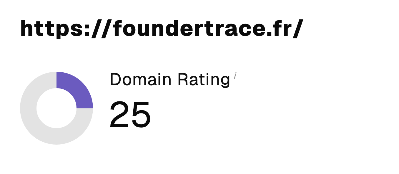 “I just let the Sorank software do its thing, and now my DR is 25 and my page is ranking higher.”
 Lucas Flandrefoundertrace.fr“I specialized in GEO thanks to Sorank. The GEO Leaderboard allows me to show my clients their position vs competitors on ChatGPT. It’s a real commercial differentiator.”
 MélanieSEO Freelance“Great service, works well for our website and helps us understand how to improve it to rank better on Google and elsewhere. Congrats, keep going, I recommend it.”
 Hugo T.E-commerce merchant